Setting the Tone
Agora’s colour palette was inspired by the 2025 Pantone Colour of the Year, ensuring a fresh and forward-thinking brand presence. The colours strike a balance between innovation and warmth, reflecting Agora’s mission to create inspiring, functional workspaces. The brand’s typeface and photography positions Agora as a premium yet community-focused brand.
Merch That Stays On You
Agora’s merch is about community. I designed it to be an extension of the brand experience, something members would genuinely love to wear. The goal was to create pieces that felt stylish, expressive, and seamlessly integrated into everyday life. This approach led to bold, dynamic designs that go beyond typical corporate swag, making Agora’s merch a true representation of its vibrant, inclusive culture.


Bringing the Brand to Every Touchpoint
Agora’s identity was woven into every interaction. From the website to the fundraising deck, I ensured the brand’s essence was consistently reflected, creating a seamless experience for both visitors and stakeholders. This cohesive approach ensured anyone engaging with Agora, whether online or through the deck, to instantly connect with its vision and brand emotions.


Scaling Agora’s Message
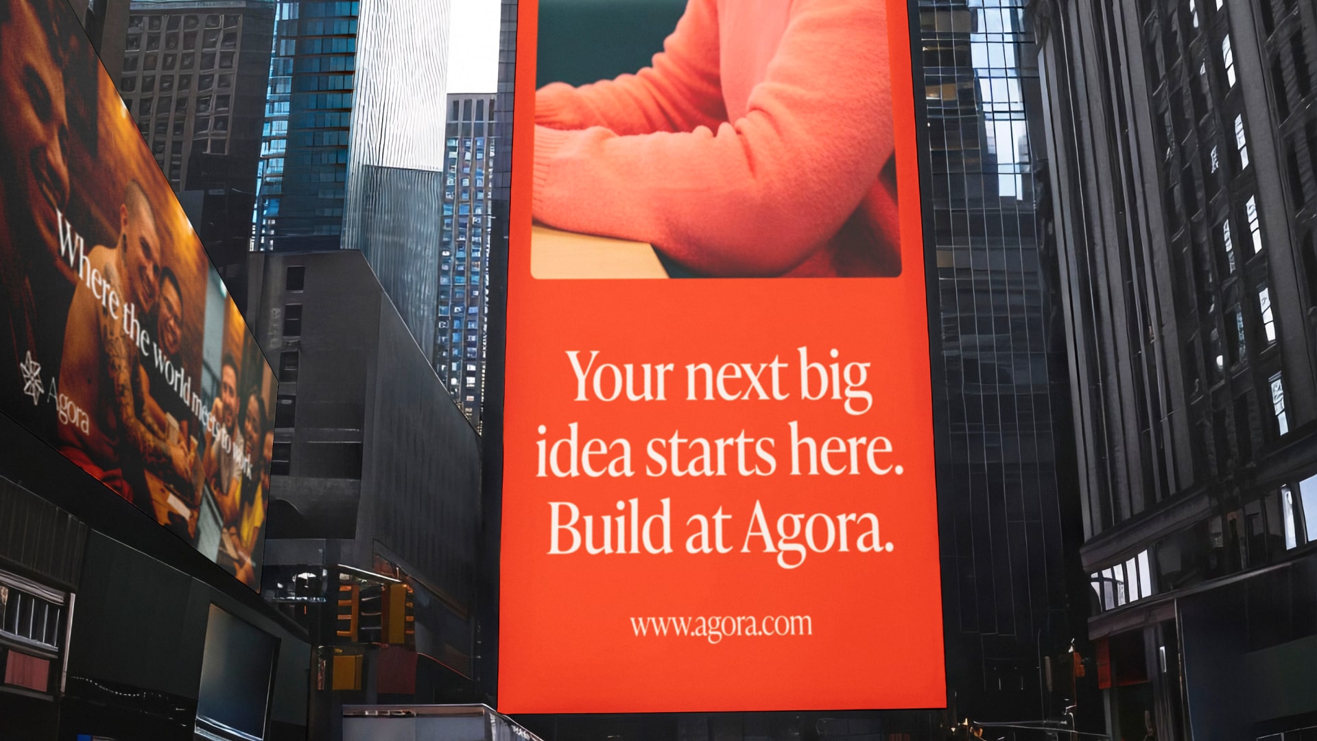
Clear and effective communication is essential for any brand with a strong message, and it was a top priority for Agora. To ensure consistency and adaptability, I designed five interconnected layouts for Agora’s out-of-home communication. This flexible system allowed the brand’s messaging to scale effortlessly across different billboard sizes and formats while maintaining a cohesive visual identity.


