

An In-Depth Look at the Agora Case Study
Designing Agora’s Identity: A Case Study
Agora is a personal project born from my desire to design a brand identity for a co-working space. My projects have always been an avenue to push creative boundaries, and this was no different. I took a fresh approach, experimenting with a new way of approaching a project while also learning the Lumos framework for building websites on Webflow.
I usually follow a structured process when designing identities, but with Agora, the process felt more fluid. While there was a framework, I allowed myself the flexibility to work on different phases as inspiration struck. For instance, I worked on the merch design as soon as I finalised the colours and typeface, something I would typically save for later in my process. This random flow made Agora a unique experience for me.
Building the Brand Idea
Agora is a premium, community-driven co-working space designed for students, remote workers, digital nomads, and teams of all sizes. It bridges the gap between the high costs of traditional office rentals and the isolation of working from home, offering an affordable, collaboration-rich environment where people can connect, create, and grow. With workspaces in five strategic locations across Africa, Asia, and Europe, Agora is positioned in regions where remote work is thriving and economically viable.
From the start, I wanted every aspect of the Agora project to feel cohesive yet unexpected. Even the logo came about by chance (more on that later). The idea “Where the world meets to work” became the foundation of the brand’s identity, supported by secondary ideas like “Your next big idea starts here” and “Your professional network just got bigger.” These ideas reinforce Agora’s core value: a space where connections happen organically, creating opportunities to collaborate, build groundbreaking ideas, and advance careers.

Designing the Logo
The Agora logo was designed in 2023 as part of a logo design exercise to refine my skills. What started as an unplanned exploration quickly became one of my favourite logo designs. The word Agora means a public gathering place or central hub in ancient Greek. Such a perfect name for the logomark. At its core, the logo consists of six letter A’s arranged in a circular formation, representing collaboration and co-working. But here’s the twist, What if I told you I wasn’t trying to design a logo based on letter As? Or that the logo is just overlapping rotated letter Ws? This unplanned discovery set the entire visual direction for the project.
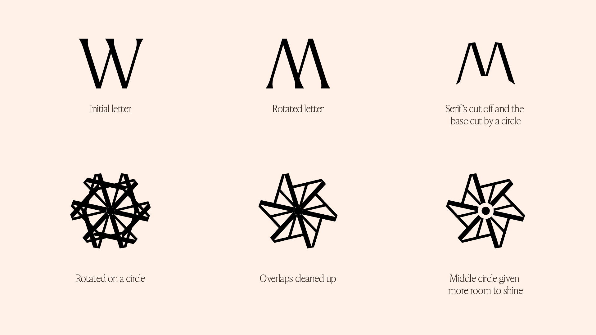
Here's a process video on how the logo was created.
To reinforce Agora’s premium positioning, I paired the logo with Larken, the same serif typeface from which the letter W was derived. From there, I developed the Agora Petal, a secondary symbol created by rotating the logo itself. This became a versatile sigil for the brand, adding another layer of depth to the identity.
Once the logo and sigil were finalised, I collaborated with Tunbosun Tobiloba, who helped animate the Agora logo. With that, I later animated the Agora Petal, ensuring the entire identity had a dynamic and cohesive visual presence.


Building the Visual System
When I discovered Pantone’s 2025 Colour of the Year, I knew it was the perfect colour for Agora’s identity. I wanted a limited palette yet extended, so I explored additional shades from the Pantone library, all within the brown family. I experimented with complementary colours, eventually settling on orange and purple to add contrast. While I struggled to use the purple colour as the project naturally leaned towards the Agora Browns and Orange, it remained a part of the system. Keeping the palette anchored in earthy tones reinforced the premium, sophisticated aesthetic I envisioned for Agora.
Choosing a typeface was a much more instinctive decision. I knew I wanted a serif to elevate the brand’s presence, and as soon as I found Ivy Presto, it just felt right. Rather than following the conventional approach of pairing a serif with a sans-serif, I decided to break the norm. Nine times out of ten, I would default to that pairing but this time, I chose to embrace the unexpected, which has been the project’s theme for me. Ivy Presto stood strong on its own, effortlessly carrying the brand’s voice while reinforcing Agora’s identity as bold, refined, and timeless.

Designing Merch That Stays On You
With the colour and typography locked in, I turned my attention to merch design. I wasn’t interested in creating just another set of branded items. I wanted merch that a community would genuinely love to wear, not just stash away in a drawer. As my good friend Akin Theodox puts it, “merch that stays on you.” That idea shaped my entire approach.
To ensure the merch felt deeply connected to the brand, I incorporated copies generated with the help of ChatGPT, phrases that would be used across Agora’s identity. Using these on the merch reinforced a cohesive brand experience across all touchpoints. The collection featured tees, bucket hats, tote bags, and hoodies, regular staples for any remote worker, freelancer, or digital nomad. Each piece was designed to be functional, stylish, and a true extension of the Agora community.
Harnessing the Power of AI-Generated Photography
Photography was the next challenge. I needed consistent, high-quality images that captured Agora’s workspaces, its community and its people. Relying on stock photos would have made it difficult to achieve a cohesive look, and since this was a personal project, custom photography wasn’t an option. That’s where AI-generated imagery came in. This was my first deep dive into AI image generation, and I didn’t know what to expect. I started by asking ChatGPT to generate prompts, which I then tested across different platforms—ImageFX, Visual Electric, and Freepik. Each tool produced similar results, but Google’s ImageFX stood out as the best option.
At first, the AI-generated results were too vague, the prompts contained too many words. By simplifying the prompts, I refined the outputs significantly. The first successful batch featured workspace interiors, followed by people working within them. However, after downloading the images, I noticed key issues:
- Lower image quality than what was previewed on ImageFX.
- AI-generated eyes looked unnatural on images featuring people.
To solve this, I returned to ImageFX and adjusted the prompts, specifying closer shots for better facial details. This improved the eyes, but the quality issue persisted. Freepik’s image upscale helped enhance the resolution, making the images usable. Huge thanks to Farouq Osuolale for the tip!
Through this process, AI-powered photography allowed me to achieve a unified and consistent look for Agora, which would have been nearly impossible to achieve through stock photography.

Bringing It All Together: Agora’s Communication System
With the images set, it was time to craft Agora’s communication system. The final piece that connects the logo, colours, typography, merch, and photography into a seamless brand experience.
I started by designing a layout system for out-of-home (OOH) communication, ensuring that Agora’s presence on billboards and public spaces felt cohesive. Instead of a one-size-fits-all approach, I developed five different yet interconnected layouts. This flexible system allowed for variations in placement and format while maintaining visual consistency, making every billboard feel unmistakably Agora.
Beyond OOH advertising, I expanded the communication system to include data-driven messaging, showcasing statistics that highlight the impact and success of remote work, reinforcing why Agora was the ideal workspace for modern professionals. This final phase tied everything together, transforming Agora from just a concept into a fully realised, premium co-working brand with a clear, compelling, and visually striking identity.

Deck Design
After the layout system, I moved on to designing the website (which I'll cover in a separate article) and then the deck design. I approached Agora’s deck as a real fundraising document, ensuring it felt like a seamless extension of the brand’s identity, visually similar and unmistakably Agora.
During the process, I encountered a critical typography issue. Deji Ajetomobi pointed out inconsistencies in my type sizing, and upon reviewing the document, I realised I had used 24 different type sizes across the pages. To fix this, I streamlined the typography to 12 sizes—4 each for headers, numbers, and body text—bringing much-needed consistency and readability to the design.
Key Takeaways
1. AI-Generated Images Are a Game Changer
I have a deep respect for stock imagery and will continue to use it when possible, but for a project like this, custom photography would have been essential to achieve the level of cohesion and consistency I needed. Stock images simply couldn’t deliver that. AI-generated images, on the other hand, gave me complete creative control, allowing me to craft a unified and tailored look. While the image quality still doesn’t match the sharpness of premium stock photography, AI is rapidly evolving and I wouldn’t be surprised if it soon becomes the go-to tool for brand design and visual storytelling.
2. Storytelling Elevates Design
When I started working on Agora, I knew it had to be more than just another personal project. I wanted it to feel like a real, functioning brand. A strong visual identity isn’t just about aesthetics, it’s about telling a story. With Agora, every design choice was rooted in a narrative, from the serendipitous creation of the logo to the community-driven messaging. This approach made the brand feel more authentic and meaningful rather than just a collection of well-designed elements.
Storytelling helped me go beyond just “what looks good” to why it matters. It gave the brand depth, made it more engaging, and ensured that every touchpoint felt connected and intentional. A great design can capture attention, but a great story keeps people invested.