

An In-Depth Look at the Mercurie Case Study
Rebranding Mercurie: A Case Study
In 2024, I had the opportunity to collaborate with Mercurie’s team to redesign their brand identity. Having previously worked on the identity of one of their sub-brands in 2021, I had an existing relationship with the company. This time, Mercurie needed a complete rebrand as they consolidated all their products under a single, unified entity.
Mercurie had pioneered a game-changing solution that rapidly expanded to serve multiple markets. In Nigeria and across Africa, paying for subscriptions and digital ads is a complicated process. Businesses struggle with high foreign exchange fees and deal with the inconvenience of paying in dollars while earning in local currency. Mercurie tackled this issue head-on by enabling Nigerian businesses to pay for Google Ads and subscriptions directly in Naira. Their premise was simple: why should businesses that earn in Naira pay in dollars? This led to the launch of Adpay, a product that quickly gained traction. Building on its success, Mercurie introduced Saaspay and Cloudpay, expanding its solution to cover SaaS and cloud subscription payments.
To bring Mercurie’s new identity to life, I collaborated with Akin Theodox and Deji Ajetomobi, leveraging their creativity and unique perspectives to craft a brand that reflects Mercurie’s vision and impact.
The Brand Idea
After our initial onboarding call with the Mercurie team and gaining a clear understanding of their vision, Akin, Deji, and I began brainstorming how to bring the new Mercurie identity to life. Given the company’s deep-rooted commitment to empowering African businesses, we drew inspiration from both Nigeria and the broader African landscape. At the same time, Mercurie wanted to avoid the conventional "techy" look, so we needed to strike a balance, creating an identity that resonated with them while positioning them competitively within the industry.
To explore different possibilities, we curated a mood board showcasing two design directions. The Mercurie team loved elements from both, leading us to merge the strongest aspects into one. At the core of the rebrand was the idea of "Earn local, pay local," reinforcing Mercurie’s mission of enabling businesses to thrive using their local currency. This concept was further supported by a broader vision of empowering people to do their best without the barriers of currency conversion.

The Logo
From our early discussions, Mercurie emphasised their desire for a logomark, ideally one that could seamlessly integrate with the rest of their name. Keeping this in mind, we explored various design directions that combined a logomark with the rest of their name. Ultimately, our strongest concepts were those that paired both a logomark and wordmark, ensuring the brand had a distinct yet unified identity.

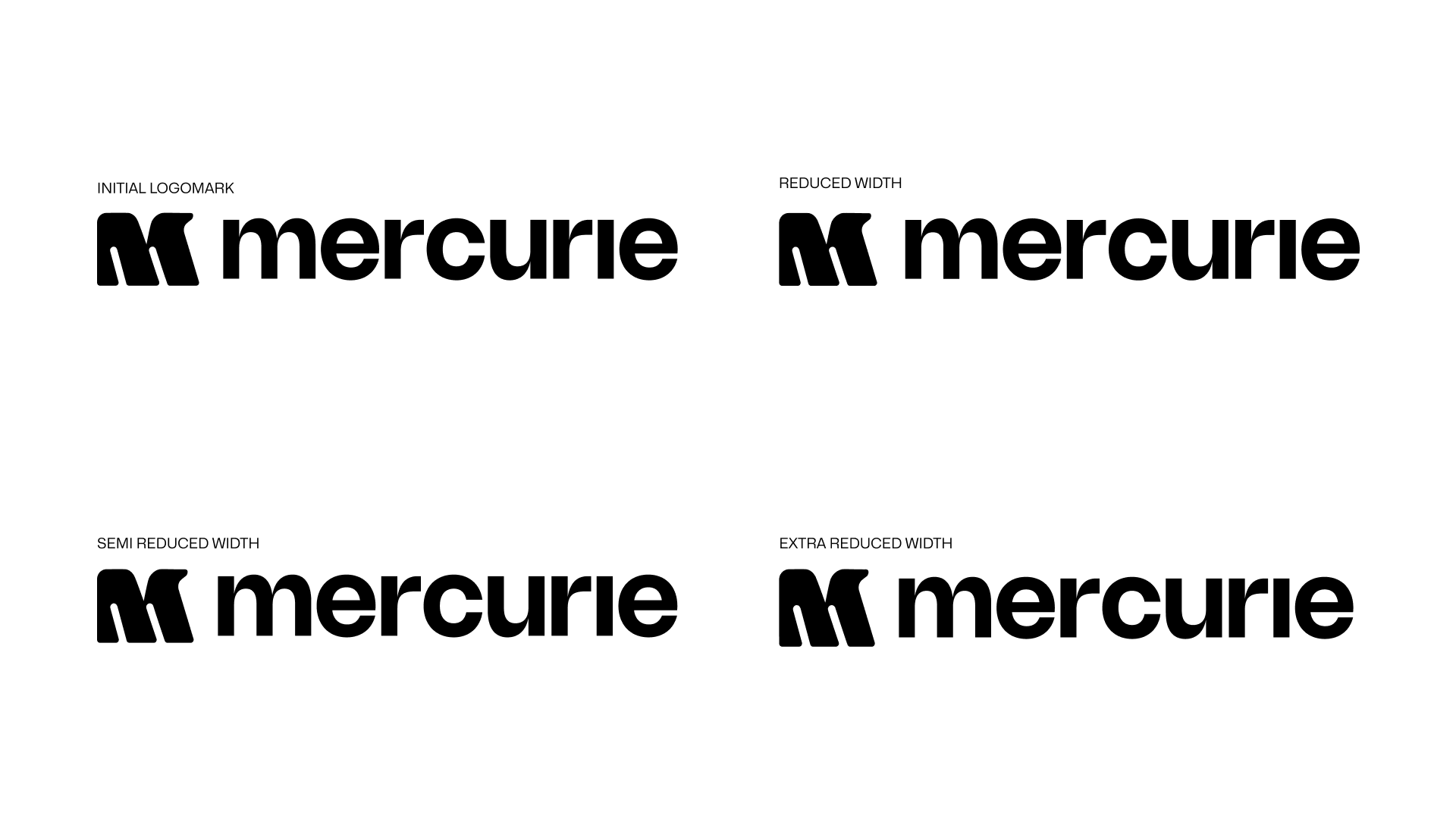
When we presented two refined concepts to Mercurie, they immediately gravitated toward what became the final logo but provided insightful feedback. One key concern was that the logomark appeared too bold. While they wanted to exude confidence, the weight felt overpowering. To address this, we iterated through three different weight variations, ultimately selecting the semi-reduced width that struck the right balance. Additionally, they requested to see the logomark without its offshoot to compare the impact. After reviewing both options, they decided the offshoot version created a sense of balance missing in the alternative. For the wordmark, we refined the details by removing the dot on the letter "i," which resulted in a cleaner, more compact look.
Colours and Typography
For Mercurie's colours, we sought inspiration from African currencies while ensuring versatility so each product could have a distinct colour within the brand. However, since Mercurie had yet to expand beyond Nigeria and given the similarities in currency colours across some African countries, we ultimately chose the Nigerian currency as our primary reference.
Mercurie wanted to retain blue as their primary colour, and we aimed to align the palette with their values and personality. To achieve this, we refined the blue to be more energetic and vibrant. Alongside the logo, we presented two distinct colour systems. While they appreciated the system, they expressed concerns about sustaining such a robust colour system. In response, we refined the approach, simplifying the system to ensure it remained simple and adaptable for their team. Deji Ajetomobi was our chief colour connoisseur.

Alongside the logo and colour palette, we also presented two typeface options: Nohemi for headers paired with General Sans for body text, and Mona Sans as a second option. While they loved Mona Sans, they felt a typeface with more personality would be a better fit for their headers. After exploring various options, we introduced Bricolage Grotesque 36pt as a header typeface. This particular variation of the typeface stood out for its visual balance and distinctive character. The team immediately resonated with it, making Bricolage Grotesque 36pt the chosen header typeface, with Mona Sans retained for the body text. For internal documents within Google Suite, we replaced Mona Sans with Inter as Mona Sans couldn’t be used in Google software.
Visual System
For Mercurie’s visual system, we developed a set of adaptable design devices and patterns. The devices were directly inspired by the logo, extracting key features to create unique standalone elements. The ink-trap from the logo, named Impulse, served as the foundation. By cutting it at an angle against itself, we formed Fusion. Astra emerged from the intersection of the logo’s offshoot and the logo’s left side, refined with precise cuts on all sides of Impulse. These devices were designed to be highly flexible, adapting to different widths and heights. Astra, in particular, allowed for seamless movement along both vertical and horizontal axes, enabling endless variations.

For patterns, we drew inspiration from the intricate hatchings found on Nigeria’s naira currency. Recognising Akin Theodox’s expertise in pattern design, I tasked him with developing halftone and dotted patterns, ensuring depth and texture within the system. He explored multiple concepts and colour variations for the halftone patterns, while I focused on creating the tile patterns. Together, these elements formed a cohesive and dynamic visual system that reinforced Mercurie’s brand identity across various applications.

Illustrations and Iconography
Mercurie wanted a set of custom illustrations and icons to enhance their website, product, and marketing materials. These visuals were designed to simplify complex ideas and provide additional context where needed. To ensure consistency with the brand identity, the illustrations and icons were angled to match the ink traps in the logo, making them distinctly Mercurie.
Before creating the illustrations, I first outlined key scenarios that needed to be visually represented. Staying true to the brand’s adaptable nature, the illustrations were designed with modularity in mind, allowing new variations to be created effortlessly by adding or removing elements from existing designs. This approach ensured a dynamic and flexible illustration system that could evolve alongside the brand’s needs.

Social Media Templates
I worked with Akin and Deji to design a set of social media and ad templates for Mercurie, where all elements of the visual system seamlessly came together. The colours, typefaces, visual containers, and patterns were integrated to create a cohesive and recognisable brand presence. These templates serve as a structured yet flexible framework for announcements, updates, and campaigns, ensuring that every piece of communication feels unmistakably Mercurie.

Final Thoughts
Although Mercurie handled the website development in-house, we were thrilled with how seamlessly they translated the visual identity into their digital presence. They effectively applied the design elements, ensuring consistency across the site. My favourite aspect of this entire project has been the cohesive and unified brand experience. Every touchpoint, from the website to social media, feels like an extension of a dynamic, flexible brand that will continue to evolve.