

An In-Depth Look at the Agora Website Case Study
Designing Agora’s Website: An In-Depth Look
Every personal project is a chance for me to learn something new, sharpen a skill, or just surprise myself with how deeply I can think through an idea and bring it to life. Designing and developing Agora’s website was all three.
I've always embraced being a jack-of-all-trades designer. Over the past two years, I’ve added website design and Webflow development to my toolkit. But because I only used those skills when needed, sometimes months apart, I hadn’t been able to develop them at the pace or quality I wanted. So when I started working on Agora, it was clear: I wasn’t just going to design a website. I was going to build it, too. Using Webflow, no shortcuts.
The Website Design - The Homepage
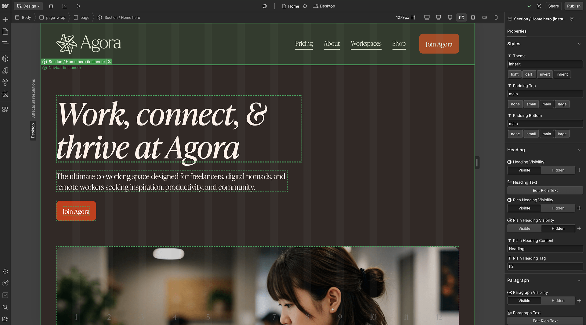
After wrapping up the brand design for Agora in January 2025, I dove straight into designing the website. I began by mapping out the structure, planning the content for the homepage, organising the information hierarchy, and defining how each section would flow. I knew from the beginning that I didn’t want just a single landing page. I wanted to design a multipage site. I decided to focus on five pages — The Home, About, Workspaces, Pricing, and Shop pages — pages that would not only present Agora’s story but reflect a full brand experience. I also saw this as an opportunity to think beyond a typical landing page and show prospective clients how I could extend a landing page into a consistent, functional website.
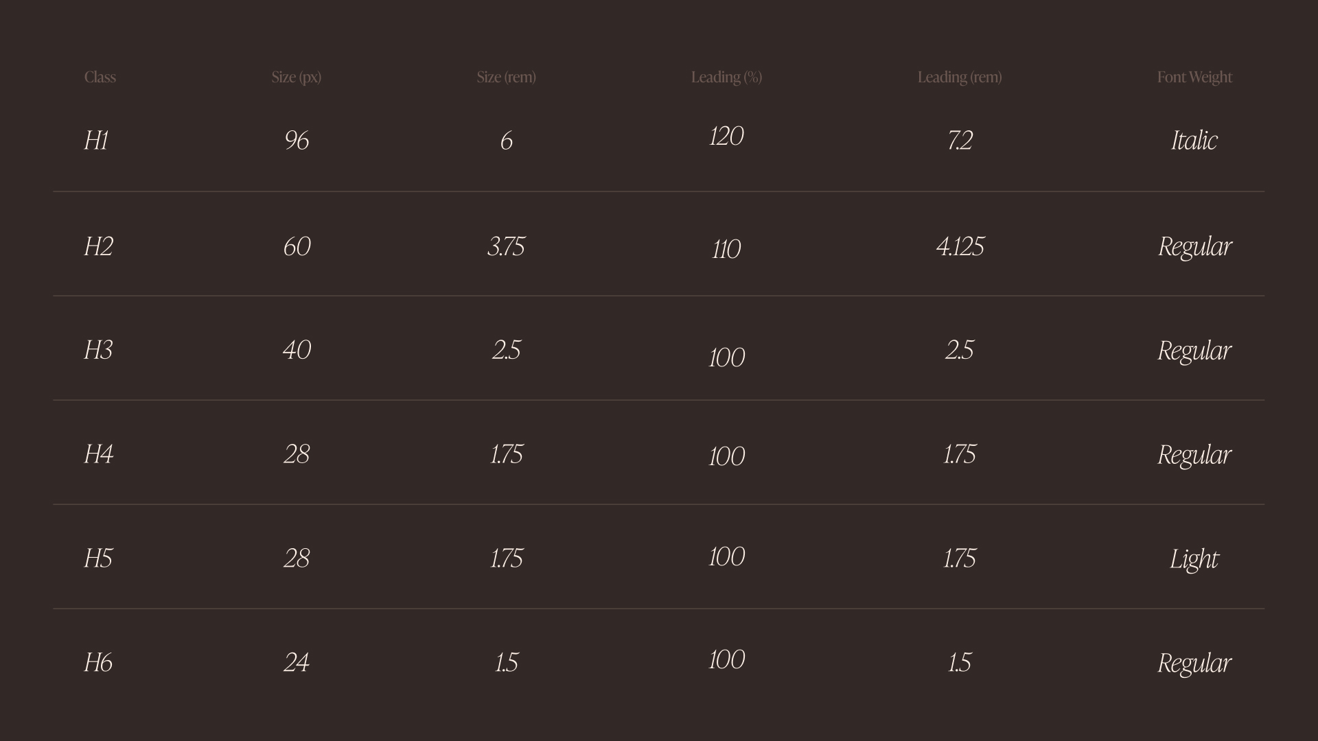
A learning goal for me on this project was adopting Timothy Ricks’ Lumos Framework during development. That meant I needed to design with responsiveness and scalability in mind, noting my “px and rem” type sizes right from the start. I tend to freestyle typography a little too much and refine later, but this time, I was determined to get it right from the jump.
As I designed, I was already thinking of the interactions I wanted to implement, from the auto-sliding workspace section, to the benefits area with autoplay tabs, to a testimonial section where the biggest testimonial card switches every 4 seconds. Some of these I already knew how to build, others I knew which tutorials I’d need to follow. That planning made the development smoother.
Because the Agora brand is photography-led, I generated images via ImageFX, showing the users, workspaces, and community around Agora. I also designed six custom icons specifically for the membership section, the only part of the website that features icons, so I wanted them to stand out. To bring them to life, I animated each one to reveal as users scroll into view in Webflow.
The Website Design - About Page
I wanted the About page to feel like a unique experience, yet connected to the website’s identity. It needed to tell Agora’s story, past and present, while showcasing its values and mission. Given how text-heavy the content on this page could be, I designed the sections with intention. The story, mission, and vision became interactive tabs, keeping the section digestible and clean.
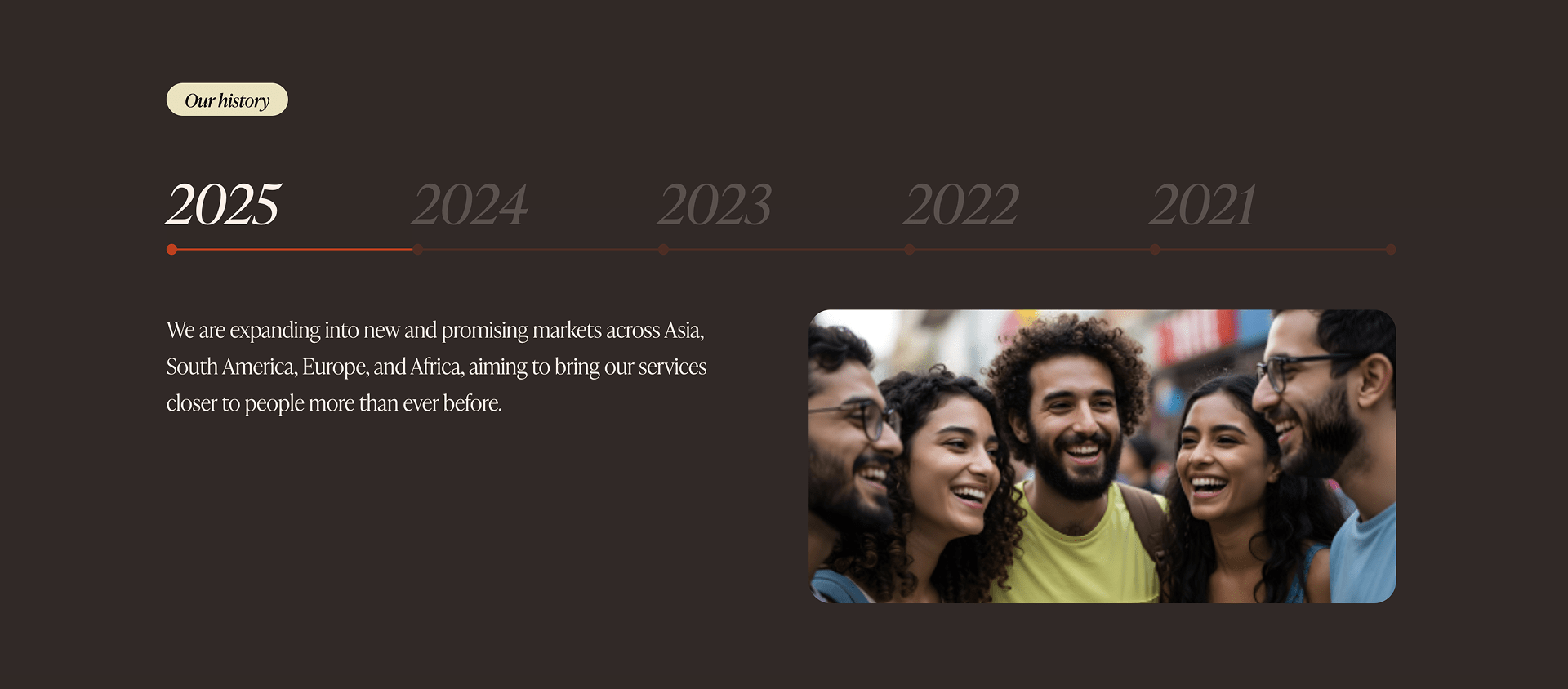
For the timeline of Agora’s history, I pulled inspiration from AngelList’s website and created a horizontal click-based timeline that lets visitors journey through key moments in the company’s evolution. I also wanted the page to feel personal. So I added a team section, featuring a diverse group of people who reflect Agora’s global roots.
The Website Design - Pricing, Workspace and Shop Pages
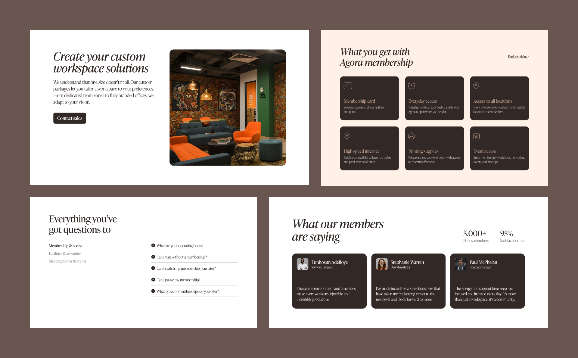
I reused key homepage sections like FAQs, memberships, and audience on both the Pricing and Workspace pages, but added variation in structure. For example, the Pricing page kept the top half of the testimonials section (the timed switching testimonials), while the Workspace page retained the bottom half (smaller testimonials). A small but intentional way to keep variety while maintaining consistency.
For the Shop page, I showcased some of the cool merch I had designed for Agora as an opportunity for the company to cultivate its community-building. I imagined members not just using Agora, but wearing it, and identifying with it.
The Website Development - Challenges
I discovered the Lumos Framework while taking a course to level up my Webflow skills, and I instantly knew I wanted to use it to build Agora’s website. What impressed me most was how it handled responsiveness — not just at fixed breakpoints like Webflow normally does, but fluidly across all screen sizes, from mobile to desktop. It automatically adapted layouts at any width, cutting down the time usually spent on making a site mobile responsive. For me, it was a no-brainer.
I spent about two weeks designing the Agora website, but the development? That took five months. It was never meant to drag on that long. I originally planned for a focused 2–3 week sprint, but the Lumos Framework had other plans for me. I dived into every tutorial and documentation I could find, convinced I understood it. I set up my colours, typography, and sizing variables in Webflow just like the tutorials showed, and even developed the homepage. But something was off. My site wasn’t adapting across different sizes like the framework. So I retraced my steps, rewatched the tutorials, and tried debugging, but couldn’t pinpoint exactly what went wrong. The biggest issue? Type scaling. The Lumos Framework scales type responsively. What this means is a 6rem heading (96pt) at 1440px should smoothly shrink on smaller screens, maybe down to 36pt at 320px. But for some reason, mine stayed 96pt at every screen size. How? Why? I had no idea.
To fix it, I scrapped everything and started afresh in a new Webflow project. Around that time, T. Ricks dropped another tutorial on YouTube, and he included a Webflow template. I cloned it and used it as a foundation for my second attempt. I set up all my variables again, rebuilt parts of the homepage, and while some issues lingered, at least the type sizing problem had finally started to make sense. But then life happened, and I got busy with school and client work, so the project had to take a backseat. From mid-January to mid-April, Agora was on pause.
By mid-April, I decided to pick things back up on the weekends. Thankfully, the Lumos Framework had evolved by then. There was now a plugin that made setting text sizes for desktop and mobile a lot simpler, all while referencing variables. It made the whole thing easier to wrap my head around. This time, I returned to the project with fresh eyes and full determination. The framework had changed, and so had I. I wasn’t going to let this beat me. Very few things I commit to get the better of me, and this definitely wasn’t going to be one of them.
The Website Development - Progress at last
Having gotten the hang of the Lumos Framework now (more like 80%), I jumped back into development, and this time, things moved faster and smoother than my earlier attempts. Lumos is built around components in Webflow, which meant I could lean on pre-set attributes to speed up the process significantly.
As development progressed, I started incorporating custom code to bring my intended interactions to life. I fine-tuned bits of it with help from ChatGPT, and when I hit a wall, I turned to Deji Ajetomobi. Some issues were just plain frustrating. I’d spend over an hour trying to debug something, only for Deji to hop on a call and figure it out, sometimes in minutes. Usually, it was something I thought I’d already tried. Forever grateful to that guy.
I poured a lot of time into perfecting the homepage, partly because many of its sections were reused across other pages, and I wanted to avoid fixing the same issue multiple times. From mid-April to mid-May, I spent weekends fine-tuning every detail. One weekend was completely consumed by a bug with the scroll-triggered text animation. The issue? The animation code didn’t account for italicised headers, only upright ones. I spent about ten hours (yes, I checked) on that Saturday trying to fix it. Eventually, I got it to work by tweaking the CSS with some padding and margin. It solved the issue, but made the line-height taller and added more space between letters. Not ideal, but I could live with it.
Just when I thought I’d cracked it, I tested the site on mobile, and boom, the fix didn’t apply. On mobile screens, some letters were getting cropped because each word was wrapped in a span. I spent another four hours and ran through a ton of variations with ChatGPT and Gemini before it finally worked. But even then, it worked fine on Android but not on iOS. I was like “Which kain wahala be this?” 😤

I was left with two options: make all my headers upright or keep them italicised and accept that they might get cut off on iOS. But there’s just something joyful and expressive about those italics — they brought the tone I wanted. I couldn’t bring myself to let go of them, so I took my L and moved on.
The Website Development - Developing for Responsiveness
Many of the interactions I originally planned were designed with desktop or laptop users in mind, but not all of them translated well to mobile. I had to create alternate versions of some sections specifically for mobile. One example is the timeline section on the About page. On desktop, I used a tab component to guide users through the story, but replicating that on mobile using vertical flex would have broken the flow. I designed a separate mobile version using a slider instead, giving users a more intuitive way to navigate the content. I took the same approach with other sections, too, like the homepage slider that reveals a workspace’s location on hover. Since hover interactions don’t work on mobile, I adapted that section so the location info appears on-screen alongside the image as it slides in.
Reflections and Wins
Building Agora’s website took perseverance, patience, a fair share of frustration, and moments of doubt, but I knew that to bring the vision to life, I had to embrace the rough terrain. This project pushed me, challenged me, and ultimately helped me grow. I learned so much and deepened my knowledge of Webflow — two of my biggest goals going into it. It wasn’t easy, but I’m proud of how it turned out.
As you browse through the site, I hope you feel the thoughtfulness, craft, and intentionality woven into each page. I’d love to hear your thoughts or feedback if you have any.
Here’s the link to the live site
Thanks so much for reading.
Here are the tutorials used during this project